
Visual History of Financial Crises
Size:
48 x 24
Visual History of Financial Crises
If you have any questions, you are always welcome to contact us. We'll get back to you as soon as possible, within 24 hours on weekdays.
-
Shipping Information
Use this text to answer questions in as much detail as possible for your customers.
-
Customer Support
Use this text to answer questions in as much detail as possible for your customers.
-
FAQ’s
Use this text to answer questions in as much detail as possible for your customers.
-
Contact Us
Use this text to answer questions in as much detail as possible for your customers.
Visual History of Financial Crises
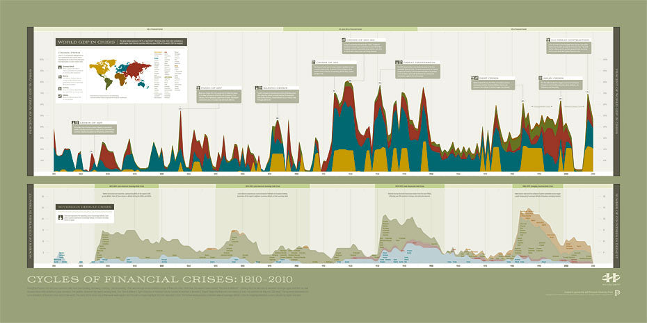
This graphic is based on the best selling This Time Is Different: Eight Centuries of Financial Folly by Carmen M. Reinhart & Kenneth S. Rogoff. Using data developed by Reinhart and Rogoff, it maps the cyclical history of financial crisis from 1810 to 2010 for sixty-six countries representing 90% of world GDP.
The giant wave in the top section of the graphic depicts the percentage of world GDP by region in crisis during the 200 year period. The bottom section provides a detailed chart of all sovereign defaults by country, region and year. It shows the repeating nature of sovereign default, a central theme of Reinhart and Rogoff's book.
Created in partnership with the Princeton University Press, this graphic provides a comprehensive yet accessible view into the historical and current cycles of financial crises.
PAPER & PRINTING
Printed on archival-grade, acid-free matte fine-art paper with a natural surface for crisp detail, accurate color, and lasting display quality.